

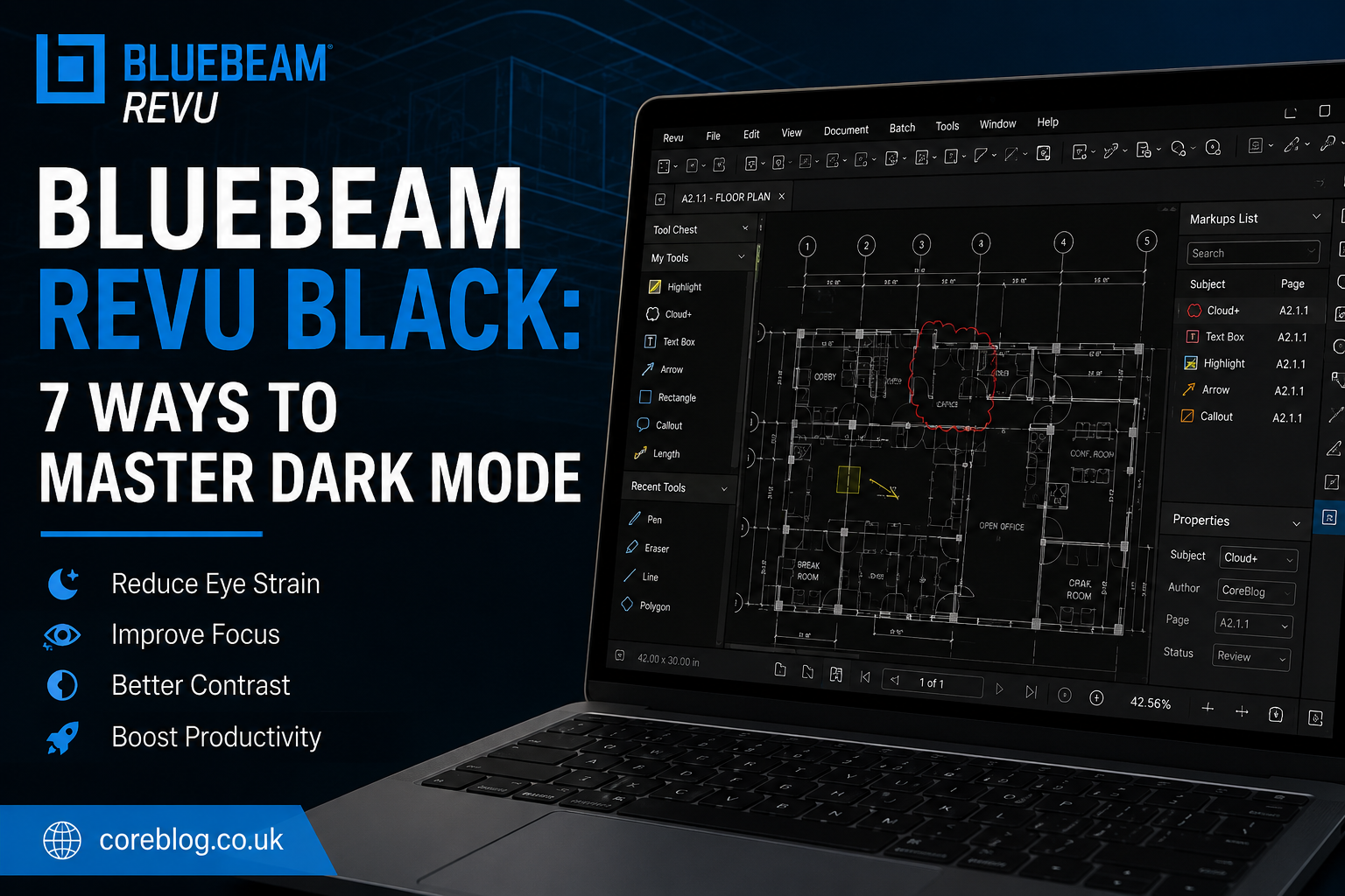
Bluebeam Revu Black: 7 Ways to Master Dark Mode
Opening a bright construction drawing late at night can feel like staring into a spotlight. The white PDF page fills the screen, toolbars compete for attention, and your eyes begin to feel tired long before the review is complete.
That is where Bluebeam Revu Black can make a real difference.
A darker interface can create a calmer workspace, reduce screen glare, and help important markups stand out. It can also make Bluebeam Revu feel cleaner and easier to use, especially when you spend several hours reviewing plans, completing takeoffs, checking revisions, or managing technical documents.
However, dark mode is not just about changing the interface from white to black. To get the best result, you must balance the application theme, PDF page display, markup colors, monitor brightness, toolbar layout, and accessibility settings.
In this guide, we will explore seven practical ways to master Bluebeam Revu Black without damaging document clarity or creating problems when printing and exporting files.
What Does Bluebeam Revu Black Mean?
The phrase Bluebeam Revu Black is commonly used to describe a darker Bluebeam Revu workspace. This may include a dark application theme, black panels, dark toolbars, reduced screen brightness, or an inverted PDF viewing style.
The exact settings available can depend on your Bluebeam Revu version, Windows setup, licence type, and display configuration. Therefore, some users may see a built-in dark theme, while others may need to combine interface settings with Windows display options.
A complete dark workspace can affect several parts of the software:
- Menu bars
- Toolbars
- Navigation panels
- Document tabs
- Properties panels
- Markups List
- Tool Chest
- Status bar
- Page background
- PDF content display
- Measurement tools
- Thumbnail panels
The goal is not to make every object black. Instead, the goal is to create better visual comfort while keeping drawings, annotations, line weights, symbols, and measurements easy to understand.
Why Use Dark Mode in Bluebeam Revu?
People often switch to dark mode because it looks modern. Yet the real benefits go far beyond appearance.
A well-planned Bluebeam Revu Black setup may help reduce the harsh contrast between a bright PDF page and a dark room. This can be useful for architects, engineers, estimators, contractors, project managers, and document controllers who review files for long periods.
Dark mode may also improve focus. A dark toolbar is less distracting than a bright interface, so your attention stays on the drawing.
Other possible benefits include:
- Less screen glare in low-light rooms
- A cleaner-looking PDF workspace
- Better focus on bright markups
- Improved comfort during long review sessions
- Easier navigation between panels and documents
- Reduced distraction from unused tools
- Better visibility for selected annotations
- A more comfortable setup for evening work
However, everyone sees colour and contrast differently. A setting that feels comfortable to one user may appear too dark to another. Therefore, it is worth testing several options before choosing your final workspace.
1. Enable the Dark Interface Theme
The first step is to change the Bluebeam Revu interface itself.
Open the application preferences and look for appearance, interface, theme, or general display options. The exact menu name may change between versions. When a dark theme is available, select it and restart the program if required.
This change normally affects the software interface rather than the actual PDF.
Areas the Dark Theme May Change
A dark interface may adjust the appearance of:
- Top menus
- Command bar
- Side panels
- Document tabs
- Toolbars
- Properties panel
- Markups List
- Navigation buttons
- Status controls
This is the safest place to start because it usually does not change the original document content.
Keep the PDF Page Separate
It is important to understand the difference between the application interface and the PDF page.
Changing the Bluebeam Revu theme should not permanently turn a white drawing into a black document. It mainly changes the surrounding workspace. Therefore, your print output, exported file, and original page colours should remain unchanged.
This makes the interface theme a useful choice for users who want Bluebeam Revu Black without changing the appearance of construction drawings or client documents.
2. Adjust the PDF Viewing Background
A dark toolbar can help, but the bright white PDF page may still cause eye strain. The next step is to adjust how the document appears on your screen.
Depending on your version and system settings, you may be able to alter the page display, background colour, dimming level, contrast, or viewing mode.
The purpose is to reduce brightness while protecting detail.
Avoid Extreme Colour Inversion
Turning white into pure black and black lines into pure white may sound useful. In practice, full colour inversion can create problems.
It may affect:
- Red revision clouds
- Yellow highlights
- Blue hyperlinks
- Transparent markups
- Colour-coded layers
- Safety symbols
- Electrical plans
- Mechanical drawings
- Architectural hatch patterns
- Company branding
For example, a pale yellow highlight may become difficult to see after inversion. Similarly, a red markup used for urgent comments may lose its meaning.
A soft grey background is often more comfortable than a pure black page. It lowers brightness without changing the drawing as dramatically.
Test Several Document Types
Before using one display setting across every project, test it with:
- Black-and-white plans
- Full-colour drawings
- Scanned documents
- Forms
- Specifications
- Photographs
- Site reports
- Punch lists
- Digital signatures
- Layered PDFs
A setting that works well for a simple floor plan may not work for a detailed fire protection drawing.
3. Choose Markup Colours for a Dark Workspace
Markups are a major part of Bluebeam Revu. Therefore, their colours must remain clear when you switch to a darker setup.
The default colours you used on a white background may not provide enough contrast in Bluebeam Revu Black.
Bright colours often work well, but they must still be readable when the file is printed.
Useful Markup Colour Choices
Consider using colours such as:
- Bright yellow for general highlights
- Cyan for measurements
- Orange for review notes
- Light green for approved items
- Red for urgent corrections
- Magenta for design changes
- White for temporary on-screen comments
Do not rely on colour alone. Line style, opacity, fill pattern, subject name, and author information can also help users understand a markup.
Create a Consistent Colour System
A simple colour system can save time during document review.
| Markup Purpose | Suggested Screen Colour | Extra Identifier |
|---|---|---|
| Urgent correction | Bright red | Thick border |
| General comment | Orange | Comment icon |
| Approved item | Light green | Check symbol |
| Measurement | Cyan | Subject label |
| Design revision | Magenta | Revision number |
| Information only | Yellow | Lower opacity |
This table is only a starting point. Your organisation may already use a formal quality control or revision tracking system.
Check Print Visibility
A colour that looks excellent on a black screen may appear too light on white paper. Before saving a new Tool Chest set, print or export a sample page.
Check:
- Line weight
- Fill opacity
- Text size
- Border contrast
- Grayscale output
- Black-and-white printing
- Layer visibility
- Transparency
This small test can prevent confusion later.
4. Build a Custom Dark Mode Profile
Bluebeam Revu profiles allow users to organise panels, toolbars, menus, and workspace elements for different tasks.
Instead of changing settings each time, create a dedicated Bluebeam Revu Black profile.
You might name it:
- Dark Review
- Night Shift
- Low-Light Workspace
- Dark Takeoff
- Evening Markup
A custom profile can include the panels and tools you use most often.
Suggested Dark Profile Layout
For document review, you may keep these areas visible:
- Thumbnails
- Tool Chest
- Markups List
- Properties
- Search
- Bookmarks
- Layers
For quantity takeoffs, you may prefer:
- Measurements
- Tool Chest
- Properties
- Markups List
- Spaces
- Legends
For project coordination, your layout may focus on:
- Studio Sessions
- Studio Projects
- Comments
- Attachments
- Hyperlinks
- Revision tracking
A clean profile reduces clutter. It also helps dark mode feel purposeful rather than cosmetic.
Remove Tools You Rarely Use
Too many icons can make the interface feel busy, even when the theme is dark.
Hide toolbars you do not need. Then keep high-value commands close to the document area. This may include:
- Select
- Pan
- Highlight
- Callout
- Cloud
- Text Box
- Snapshot
- Length
- Area
- Count
- Search
- Split View
You can still access hidden tools through menus or keyboard shortcuts.
5. Balance Monitor Brightness and Contrast
Software settings alone cannot create a comfortable workspace. Your monitor has a major effect on how Bluebeam Revu Black looks.
A dark application on an overly bright display can still cause fatigue. On the other hand, a screen that is too dim may hide thin lines, small text, or low-opacity markups.
Start With Moderate Brightness
Lower the monitor brightness until the screen feels comfortable, but keep enough light to see fine details.
Then review:
- Small dimensions
- Light grey lines
- Transparent fills
- Thin hatch patterns
- Scanned text
- Faded stamps
- Form fields
- Signature boxes
If any of these become difficult to see, increase brightness slightly.
Match the Room Lighting
Dark mode works best when the monitor brightness matches the room.
In a bright office, a very dark screen may cause reflections. In a dark room, a bright white page may feel harsh. Therefore, adjust your setup when the lighting changes.
It may help to create different monitor presets for:
- Daytime work
- Evening work
- Site office use
- Presentation screens
- Dual-monitor setups
Check Monitor Calibration
Poor colour calibration can make blue appear purple, grey appear black, or red appear dull.
This matters when your team uses colour-coded markups. A basic monitor calibration can improve consistency between users, especially during remote collaboration or Studio Sessions.
6. Use Split View to Compare Light and Dark Displays
Split View is one of the most useful tools for checking whether a dark setup is hiding information.
Open the same PDF in more than one view when possible. Use one view for comfortable dark-mode reading and another for checking the standard page appearance.
This can help when reviewing:
- Revised drawings
- Overlay comparisons
- Old and new specifications
- Colour-coded markups
- Layer changes
- Drawing sets
- Bid documents
- Quality control comments
Why This Method Works
A dark viewing mode can improve comfort, but it may change how you notice colour and contrast. A second standard view gives you a quick reference.
For example, a markup may look bright and clear in the dark view. Yet in the standard white view, it may blend into the drawing. Split View helps you catch that problem before sharing the document.
Combine Split View With Synchronisation
When reviewing two related documents, synchronised views can help you move through both pages at the same time.
This is useful for:
- Drawing revisions
- Addendum reviews
- Design updates
- Before-and-after plans
- Architectural and structural comparisons
- Mechanical coordination
The result is a faster workflow with fewer missed details.
7. Save Dark Mode Without Changing the Original PDF
The final rule is simple: keep your viewing preferences separate from the actual document whenever possible.
Your Bluebeam Revu Black setup should improve your own comfort without forcing the same appearance on clients, consultants, or project partners.
Before saving, exporting, flattening, or printing, confirm what will be included in the final file.
Check These Items Before Sharing
Review the following:
- PDF page colour
- Markup appearance
- Layers
- Transparency
- Fonts
- Line weights
- Images
- Form fields
- Digital signatures
- Hyperlinks
- Bookmarks
- Comments
- Page labels
- Drawing scale
Also check whether display-only settings are being applied to the file itself.
Use a Sample Page
When you are unsure, create a copy of one page and test the output.
Export it, print it, and open it on another device. This gives you a clear idea of how the document will look outside your personal Bluebeam Revu workspace.
It is a simple habit, but it can prevent expensive mistakes.
Common Bluebeam Revu Black Problems
Dark mode can improve your workflow, but a few common issues may appear.
The PDF Still Looks Too Bright
The interface theme may only affect menus and panels. It may not change the PDF page itself.
Try reducing monitor brightness, using a softer page viewing background, or choosing a dimmer display option where available.
Markups Become Hard to See
Increase the markup contrast. You can also adjust the border, fill, opacity, font weight, or line thickness.
Save the improved markup to your Tool Chest so you do not need to rebuild it.
Colours Look Different When Printed
Your monitor uses light to display colour, while printers use ink or toner. Therefore, screen colours will not always match printed output.
Always test important drawings before large-scale printing.
Thin Drawing Lines Disappear
Increase the display brightness slightly. You should also check rendering, line smoothing, resolution, and monitor scaling.
Do not assume the original PDF is damaged until you test it in the standard viewing mode.
Dark Mode Resets After Restarting
Save your interface layout as a profile. Also check whether the program is loading a default profile at startup.
In managed company environments, some settings may be controlled by an administrator.
How Bluebeam Revu Black Supports Better Productivity
Dark mode does not automatically make someone faster. However, a comfortable workspace can reduce distraction and make long review sessions easier to manage.
The strongest productivity gains often come from combining dark mode with other Bluebeam Revu features.
These may include:
- Keyboard shortcuts
- Custom profiles
- Tool Chest sets
- Batch processing
- OCR
- Visual Search
- Text Search
- Quantity takeoffs
- Calibrated measurements
- Legends
- Spaces
- Layers
- Bookmarks
- Hyperlinks
- Studio collaboration
- Markups List filters
For example, an estimator may use a dark takeoff profile with cyan measurements, a compact Tool Chest, calibrated scale, and a filtered Markups List.
A project manager may use Bluebeam Revu Black with revision clouds, comments, document tabs, bookmarks, and Studio Sessions.
The best setup depends on the work you perform each day.
Is a Pure Black Background Always Better?
No. Pure black can look stylish, but it is not always the easiest colour for reading.
A dark grey interface often provides a softer and more balanced experience. It also allows black borders, icons, and shadows to remain visible.
For many users, the ideal setup includes:
- Dark grey toolbars
- Medium-grey panels
- Soft page brightness
- High-contrast text
- Bright but controlled markup colours
- Moderate monitor brightness
This creates a dark workspace without making every area look flat.
Frequently Asked Questions
Does Bluebeam Revu Have a Dark Mode?
Some versions include appearance or theme controls that can create a darker interface. Available options and menu names may differ by version.
Will Dark Mode Change My PDF?
An interface theme normally changes the application workspace rather than the PDF itself. However, page colour adjustments, edits, markups, and export settings may affect the final document. Check the output before sharing.
Can I Make a PDF Background Black?
You may be able to change the on-screen viewing background or use display settings that reduce page brightness. Permanently changing the PDF background is a different action and should be done with care.
Is Bluebeam Revu Black Better for Night Work?
It can be more comfortable in a low-light environment because it reduces the amount of bright interface space. Monitor brightness and room lighting still matter.
Can I Save My Dark Workspace?
Yes, saving a custom profile is a practical way to preserve your preferred toolbar layout, panels, and workflow settings.
Why Do My Markups Look Different in Dark Mode?
Dark backgrounds change perceived contrast. Colours, opacity, transparency, and line weight may appear different even when the original markup values have not changed.
Final Thoughts
A good Bluebeam Revu Black setup is more than a black toolbar. It is a complete workspace built around visual comfort, clear markups, accurate document review, and reliable output.
Start with the dark interface theme. Then adjust page brightness, improve your markup colours, organise a custom profile, and balance the monitor with the room lighting. In addition, use Split View to compare document appearances and always test the final PDF before printing or sharing it.
The best dark mode setup should feel comfortable without hiding information. It should make measurements easier to follow, comments simpler to manage, and long review sessions less tiring.
Most importantly, treat Bluebeam Revu Black as a personal viewing workflow rather than a permanent document style. Your screen can be dark while the original drawing remains accurate, professional, and ready for every project partner.
Try these seven methods in your own Bluebeam Revu workspace. Then adjust the colours, panels, and brightness until the setup feels natural. Share the guide with another Bluebeam user, and leave a comment about the dark mode settings that work best for your daily workflow.















Leave a Reply