
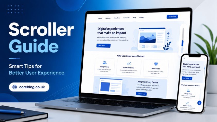
A website can look beautiful at first glance, but if users struggle to move through it, they will leave faster than you expect. That is where scrolling matters. It sounds simple, almost too simple, but the way people scroll through a website can decide whether they stay, read, click, buy, or bounce.
Think about your own habits. When you open a page, you rarely read every word from top to bottom. You scan. You move down. You pause at bold headings, images, buttons, and short paragraphs. A smooth scrolling experience feels natural. A poor one feels annoying, confusing, or slow.
This Scroller Guide is for website owners, bloggers, designers, developers, marketers, and anyone who wants to make a website easier and more enjoyable to use. Whether you run a blog, an online store, a news site, or a service website, good scrolling can improve user experience in a real way.
The best part is that you do not need to make your website complicated. In fact, the best scrolling experiences often feel simple. They guide the visitor gently, keep the page readable, and help people find what they need without stress.
What Is a Scroller?
A scroller is the feature that allows users to move through content on a webpage, app, or digital screen. It can be vertical, horizontal, automatic, manual, smooth, fixed, infinite, or interactive. In basic terms, it helps visitors explore content beyond what they see on the first screen.
However, a good scroller is more than a technical function. It is part of the user journey. It affects how people read your content, how they interact with your design, and how long they stay on your website.
In this Scroller Guide, the focus is not only on what a scroller does, but how to use it wisely. A scroller should help the user, not distract them. It should make browsing feel easy, not forced.
Why Scrolling Matters for User Experience
Scrolling is one of the most common actions on the internet. People scroll through articles, product pages, social feeds, landing pages, portfolios, and mobile apps every day. Because of this, even a small scrolling issue can hurt the full experience.
A strong scrolling experience can:
- Improve readability
- Keep visitors engaged
- Support better content flow
- Reduce bounce rate
- Make mobile browsing easier
- Guide users toward important sections
- Improve website navigation
- Help calls to action stand out
- Make long pages feel lighter
- Create a more professional website feel
On the other hand, bad scrolling can create frustration. If the page jumps, loads slowly, hides important content, or feels confusing, users may lose interest. That is why this Scroller Guide is useful for both design and SEO.
Scroller Guide for Better Website Navigation
Good navigation is not only about menus. It is also about how easily users move through the page. A well-planned scroller helps visitors understand where they are and where they can go next.
Keep the Scroll Flow Natural
A natural scroll flow means the page moves in a way users expect. The content should appear in a logical order. First, the visitor should understand the topic. Then, they should get details. After that, they should see examples, benefits, answers, and action steps.
For example, a blog post should not place a pricing table before explaining the product. A service page should not hide contact details too far down without giving users a reason to keep reading.
A natural flow makes the page feel friendly. It also keeps people from feeling lost.
Use Clear Section Headings
Headings are like signboards on a road. They tell users what comes next. Since most visitors scan before they read, headings are extremely important for scrolling pages.
Use headings that are clear, useful, and direct. Avoid vague headings like “More Information” or “Details.” Instead, use headings such as “Benefits of Smooth Scrolling” or “Common Scroller Mistakes to Avoid.”
This Scroller Guide uses clear sections for the same reason. It helps readers move through the content without confusion.
Add a Sticky Navigation Option When Needed
For long pages, sticky navigation can help. A sticky menu stays visible while the user scrolls. This is useful for blogs, product pages, documentation pages, and long landing pages.
However, sticky navigation should not cover too much screen space. On mobile, it should be small and clean. If it blocks content, it hurts the experience instead of helping it.
Types of Scrollers Used on Websites
Different websites use different scrolling styles. Each one has a purpose. The key is to choose the right type for your content.
| Scroller Type | Best For | User Experience Impact |
|---|---|---|
| Vertical Scroller | Blogs, websites, landing pages | Natural and easy to use |
| Horizontal Scroller | Galleries, sliders, product cards | Good for visual browsing |
| Infinite Scroller | Social feeds, image platforms | Keeps users engaged longer |
| Smooth Scroller | Modern websites, portfolios | Adds a polished browsing feel |
| Parallax Scroller | Creative pages, storytelling | Creates visual depth |
| Sticky Scroller | Menus, sidebars, CTAs | Helps with navigation |
| Auto Scroller | News tickers, banners | Useful but should be controlled |
Vertical Scroller
The vertical scroller is the most common type. Users move from top to bottom to read more content. It works well because it feels familiar. Most blogs, news websites, and service pages use this style.
For SEO content, vertical scrolling is usually the safest choice. It gives enough room for headings, images, paragraphs, FAQs, and calls to action.
Horizontal Scroller
A horizontal scroller moves content from left to right. It is often used for image galleries, product cards, testimonials, and portfolios. It can look stylish, but it must be easy to control.
If users do not notice that content can be scrolled sideways, they may miss important information. So, use arrows, visible cards, or partial previews to guide them.
Infinite Scroller
Infinite scrolling loads more content as the user moves down. Social media platforms use it because it keeps people browsing. It can also work for blogs, product listings, and media websites.
However, infinite scrolling is not always ideal. Users may struggle to reach the footer, find contact details, or return to a specific item. So, if you use infinite scrolling, add filters, search options, and clear loading indicators.
Smooth Scroller
Smooth scrolling creates a soft transition when users move between sections. It feels modern and pleasant when done correctly. Many websites use it for anchor links, landing pages, and portfolios.
Still, do not overdo it. If the movement is too slow or too dramatic, users may feel annoyed. The best smooth scroller is subtle.
Smart Scroller Design Tips
A good scroller design should feel invisible. Users should not think about it. They should simply enjoy moving through your content.
Make the First Screen Strong
The first screen, often called the above-the-fold area, is very important. It should tell users what the page is about and why they should continue.
A strong first screen usually includes:
- A clear title
- A short introduction
- A useful image or visual
- A clear value statement
- A simple call to action if needed
If the first screen is weak, users may not scroll at all. So, before improving the rest of the page, make sure the top section is worth reading.
Use Short Paragraphs
Long blocks of text look heavy on a screen. Even if the content is good, users may skip it. Short paragraphs make scrolling easier and more comfortable.
As a simple rule, keep most paragraphs between two and four lines. This is especially important on mobile devices, where text blocks appear taller.
This Scroller Guide follows that structure because readable content keeps users moving.
Add Visual Breaks
Visual breaks help users rest while scrolling. They also make the page feel more organized.
You can use:
- Images
- Icons
- Tables
- Pull quotes
- Bullet points
- Numbered lists
- White space
- Highlight boxes
However, every visual should have a purpose. Do not add images only to fill space. Good visuals support the message.
Place Calls to Action Naturally
A call to action should appear at the right time. If it appears too early, users may ignore it. If it appears too late, they may never reach it.
For example, a service page can place a small call to action after explaining the main benefit. A blog post can place one near the end after giving useful information.
The goal is to guide, not pressure.
Scroller Guide for Mobile Users
Mobile scrolling is different from desktop scrolling. On mobile, users rely on their thumbs. The screen is smaller. Content feels longer. Buttons must be easier to tap.
That is why mobile-friendly scrolling is no longer optional. It is essential.
Keep Mobile Pages Light
Heavy pages load slowly. Slow pages make users leave. Large images, too many scripts, and complex animations can hurt mobile scrolling.
To improve mobile experience:
- Compress images
- Avoid unnecessary animations
- Use clean layouts
- Reduce pop-ups
- Keep buttons large enough
- Test pages on real devices
- Keep text readable without zooming
A smooth mobile scroller can make a simple website feel professional.
Avoid Annoying Pop-Ups
Pop-ups can destroy the scrolling experience. A visitor may start reading, then suddenly a large box blocks the screen. On mobile, this feels even worse.
Use pop-ups carefully. If you must use them, make them easy to close. Also, avoid showing them too soon. Let users read first.
Make Tap Areas Comfortable
Buttons, menus, and links should be easy to tap. If users accidentally click the wrong thing while scrolling, they may become frustrated.
Comfortable tap areas improve usability and make your website feel more trustworthy.
How Scrolling Affects SEO
Scrolling does not directly rank a page by itself, but it affects user behavior. And user behavior can support better SEO performance.
When visitors stay longer, explore more sections, and interact with your page, it sends positive signals. Good scrolling can support these results by making content easier to consume.
Better Engagement
If users enjoy moving through your page, they are more likely to stay. They may read more, click internal pages, view products, or share the content.
Good engagement starts with clear structure and smooth browsing.
Lower Bounce Rate
A confusing page can make users leave quickly. A clear scrolling experience can reduce that problem. When people quickly understand what the page offers, they have a reason to continue.
This Scroller Guide highlights structure because clear content flow often keeps users engaged longer.
More Content Visibility
If important sections are buried or hard to reach, users may never see them. A smart scroller helps reveal your best content step by step.
This is especially useful for:
- Product benefits
- Customer reviews
- Pricing tables
- FAQs
- Contact forms
- Related articles
- Lead forms
- Trust signals
Common Scroller Mistakes to Avoid
Even good websites can make scrolling mistakes. Some are small, but they can still hurt the user experience.
Making Pages Too Heavy
Too many videos, animations, sliders, and large files can slow everything down. A slow scroller feels broken. Users may think the site is low quality.
Keep your design clean. Speed matters more than fancy effects.
Hiding Important Content
Some websites place key information too far down the page. If users have to scroll too much to find the main answer, they may leave.
Put the most important information early. Then use the rest of the page to explain, support, and persuade.
Using Too Many Scroll Effects
Scroll animations can look nice, but too many effects become distracting. If every section moves, fades, spins, or slides, the page feels busy.
Use effects only when they improve the message. Simple is often stronger.
Ignoring Accessibility
Not every user browses the same way. Some people use keyboards, screen readers, or assistive tools. A scroller should work for everyone.
Make sure users can navigate your page without a mouse. Use clear focus states, readable text, and simple page structure.
Poor Contrast and Tiny Text
If users cannot read your content easily, scrolling will not help. Small fonts and weak contrast make pages tiring.
Use readable font sizes, strong contrast, and enough spacing. A clean reading experience always wins.
Best Practices for a User-Friendly Scroller
A user-friendly scroller makes the page feel smooth, clear, and useful. Here are some practical best practices.
1. Keep the Page Structure Simple
A simple structure helps users understand your content. Start with the main idea, then move into details, examples, and next steps.
2. Use White Space Wisely
White space gives content room to breathe. It helps users focus. It also makes long pages feel less crowded.
3. Add Progress Indicators for Long Content
For very long articles or guides, a reading progress bar can help. It shows users how much content remains. This small detail can make long pages feel more manageable.
4. Use Internal Section Links
A table of contents can improve long-form content. Users can jump to the section they need instead of scrolling endlessly.
This is especially useful for tutorials, reviews, guides, and documentation pages.
5. Test the Page on Different Devices
A scroller may work well on desktop but feel poor on mobile. Always test on different screen sizes. Check phones, tablets, laptops, and large monitors if possible.
6. Keep Animations Fast and Light
Animations should support the experience, not slow it down. Use them gently. If they delay the content, remove them.
7. Make the Footer Easy to Reach
Some users scroll to the bottom to find contact details, policies, social links, or more pages. If infinite scrolling prevents them from reaching the footer, consider adding a fixed footer link or a “Load More” button.
Scroller Guide for Blogs
Blogs depend heavily on reading comfort. A blog page should feel easy from start to finish.
For blog articles, use:
- A strong title
- A short introduction
- Clear H2 and H3 headings
- Short paragraphs
- Useful images
- Bullet points
- A table when helpful
- A conclusion with a clear action
- Related posts at the end
A blog scroller should not feel like a wall of text. It should feel like a guided conversation.
This Scroller Guide is built in that style because readers want clarity, not clutter.
Scroller Guide for E-Commerce Websites
Online stores need scrolling that supports buying decisions. Users want to compare products, view images, read details, and check reviews without confusion.
For e-commerce pages:
- Keep product images smooth
- Use sticky add-to-cart buttons carefully
- Show key product details early
- Make reviews easy to reach
- Avoid forcing too much scrolling before price details
- Use filters for long product lists
- Add clear loading signs when more products appear
A good product scroller helps shoppers feel in control. That trust can lead to more sales.
Scroller Guide for Landing Pages
Landing pages need a strong flow. Every section should push the user closer to action.
A good landing page scroll often follows this order:
- Main headline
- Problem or pain point
- Main benefit
- Features
- Proof or testimonials
- Pricing or offer
- FAQ
- Final call to action
This order works because it matches how people think. First, they want to know what you offer. Then, they want to know why it matters. After that, they need proof.
Scroller Guide for Accessibility
Accessibility is not only a technical topic. It is also about respect. A website should be usable for as many people as possible.
To improve scroller accessibility:
- Allow keyboard navigation
- Avoid motion that cannot be paused
- Use readable font sizes
- Keep contrast strong
- Make buttons clear
- Do not trap users in scroll sections
- Use proper heading order
- Avoid auto-scrolling that users cannot control
When your website is easier for everyone, it becomes better for everyone.
How to Know If Your Scroller Needs Improvement
Sometimes, a website looks fine, but user behavior tells another story. You may need to improve your scroller if:
- Visitors leave quickly
- Mobile users spend less time on the page
- People do not reach important sections
- Users rarely click calls to action
- The page feels slow while scrolling
- Readers skip long text sections
- Product pages have low engagement
- Forms near the bottom get few views
You can also ask real users to test the page. Watch how they scroll. Do they pause? Do they miss important sections? Do they seem confused? Real feedback is often more useful than guessing.
Practical Checklist for Better Scrolling
Use this checklist before publishing or updating a page.
| Checklist Item | Why It Matters |
|---|---|
| Page loads quickly | Users dislike slow scrolling |
| Headings are clear | Helps scanning and navigation |
| Paragraphs are short | Improves readability |
| Mobile layout works well | Most users browse on phones |
| Important content appears early | Reduces confusion |
| Buttons are easy to tap | Improves interaction |
| Images are optimized | Supports faster performance |
| Pop-ups are limited | Reduces frustration |
| Scroll effects are simple | Keeps focus on content |
| Footer is reachable | Helps users find key links |
Final Thoughts on This Scroller Guide
A scroller may seem like a small part of website design, but it has a big impact. It shapes how users move, read, explore, and interact with your content. When scrolling feels smooth and natural, your website feels easier to trust.
The main lesson from this Scroller Guide is simple: design for people first. Keep the page fast. Make the content clear. Use headings wisely. Avoid clutter. Think about mobile users. And most importantly, make every scroll feel worthwhile.
A better scroller does not only improve design. It can improve engagement, readability, conversions, and overall user satisfaction. Whether you are building a blog, landing page, e-commerce store, or business website, smart scrolling can turn a normal page into a better experience.
Now take a fresh look at your own website. Scroll through it like a first-time visitor. Notice where it feels smooth, where it feels slow, and where users might get lost. Small improvements can make a big difference.
If this Scroller Guide helped you, share it with someone who manages a website or is working on better user experience. And if you have your own scrolling tips, ideas, or questions, add them in the comments and join the conversation.


Leave a Reply